The Shining
The first time I ever saw The Shining I was babysitting, and I was so scared I had to go to bed rather than watch the end. The image that stayed in my mind was of the little boy peddling his tricycle over miles of garish geo-print carpet.
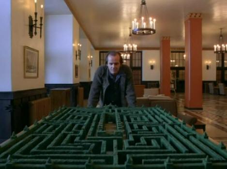
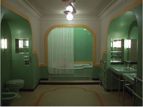
I love the films of Stanley Kubrick, and find my favourites visually arresting and engaging in a way few other directors are. David Lynch is the other director who invests interiors with a comparable sense of meaning and menace – maybe I’ll get to doing a post on that by and by. Anyway, someone sent me this film on YouTube, in which Rob Ager discusses the use of impossible and shifting interior spaces in The Shining, and the effect this has on the viewer.
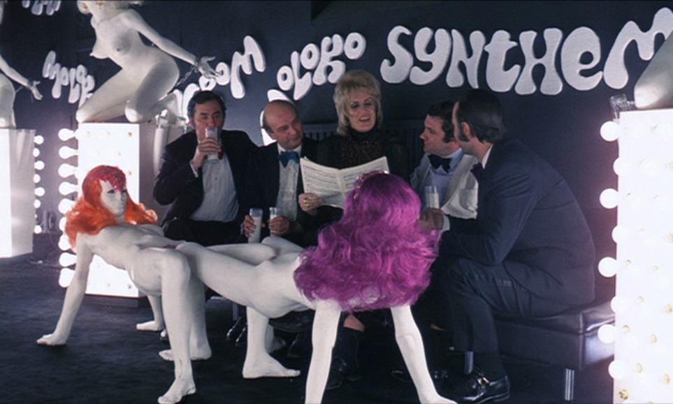
Doors and corridors that lead nowhere, a ballroom that moves from one side of the hotel to the other… I would be tempted to dismiss some of what it describes as continuity errors, if it wasn’t for Kubrick’s notorious attention to detail, and the incredible design in his other films. A Clockwork Orange featured copies of Allen Jones’ kneeling women tables in the futuristic milk bar.
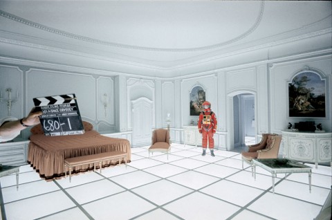
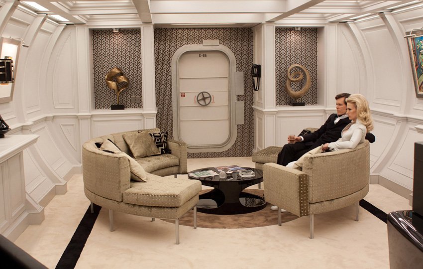
Check out this bedroom, from the end of 2001 – a still-modern looking room, and one which Philippe Starck has reworked again and again in his hotel and restaurant designs.
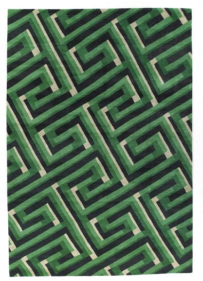
If after that you are feeling strangely compelled, by forces you barely understand, to create your own Shining style at home, here are a couple of easy buys.
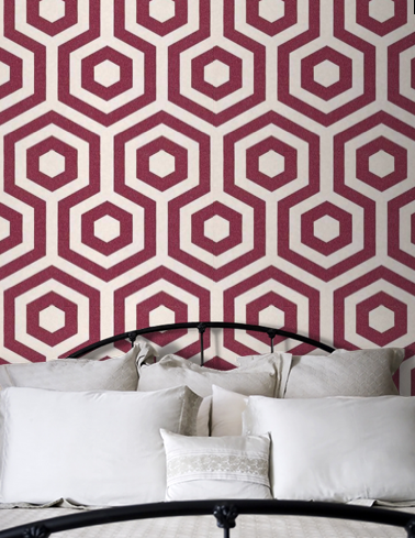


Maybe more “Nightmare on Elm Street” with this wallpaper in the bedroom.
Yes, a bit much isn’t it. A ticket to unsettling dreams.