The interiors of Aesop
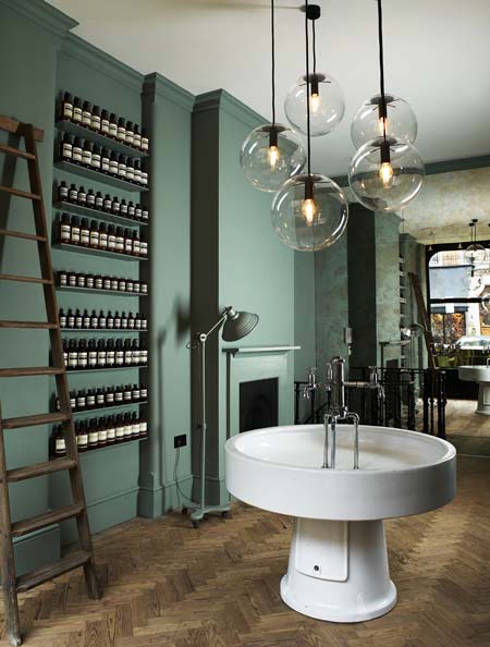
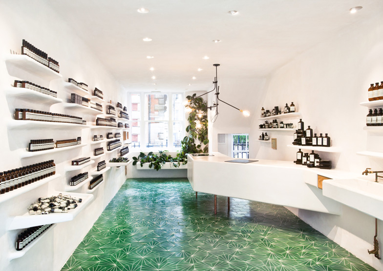
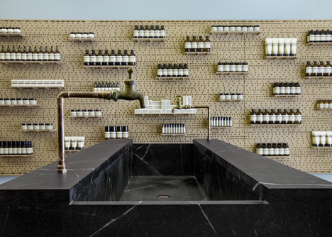
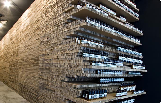
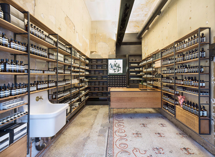
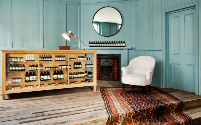
It was my tasteful French friend (again) who put me onto Australian cosmetics brand Aesop and now I can’t pass by a shop without going in. The soaps and lotions are delicious, but the interiors are even more so. The one in London’s Covent Garden has a hand-cream dispenser attached to the wall outside the door so passers by can moisturise their paws on the way past. It’s also the one with those gorgeous floor tiles. Then there’s the one designed by Ilse Crawford – nuff said – the one with pegboard walls in East Hampton, the one constructed out of cardboard Boxes (the kind used to ship the products) and the one in Richmond, which looks like something the Bloomsbury set had a hand in – possibly intentionally. It has a rug slithering down the stairs at a jaunty angle. Whether it’s the branches in London, Kyoto, Brooklyn or Bern, today’s post is basically Aesop interiors porn. Happy Friday everyone.



Beautiful! I loved the floor but also the colours used on both walls pictured..