Pink update: hold the front page
… I’ve almost decided. The weekend was spent in Margate with me peering at paint samples through a fist – it’s a good system, as it closes out surrounding colours which can throw you off, and helps me picture how the whole room might look. To an observer though it’s all very Admiral Nelson, I suppose.
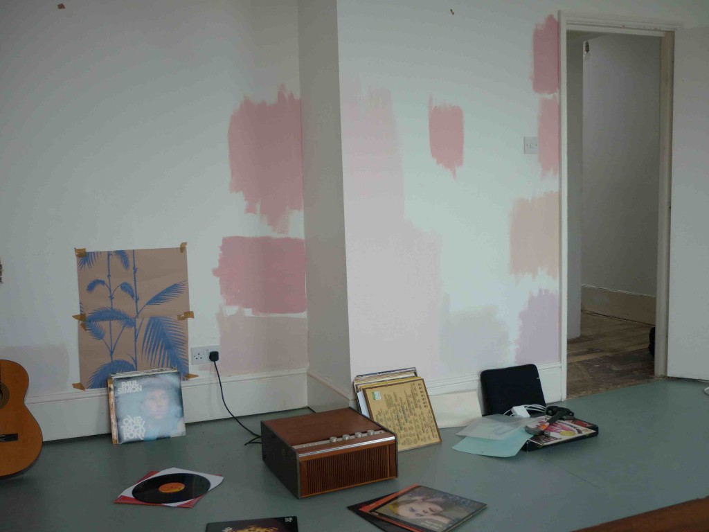
Here is the result of my researches. Mental hey? It was like eating dinner inside a stomach. The ‘gent’ said something altogether more explicit. Paint colours left to right:
Great White, Farrow & Ball; Palm wallpaper, Cole & Son; Angie, Little Greene (top); Nancy’s Blushes, Farrow & Ball (middle); Calamine, Farrow & Ball (bottom); Middleton Pink, Farrow & Ball, Great White, again. Then on the far right, top to bottom, Nancy’s Blushes; Angie; Pink Ground, Farrow & Ball; Chemise, Little Greene
Records left to right:
One Trick Pony, Paul Simon; Studio One Soul, Various Artists; Funkadelic; Soundtrack to The Stud; Best of Tammy Wynette; Hunky Dory, David Bowie; Fairport Convention; Loaded, The Velvet Underground.
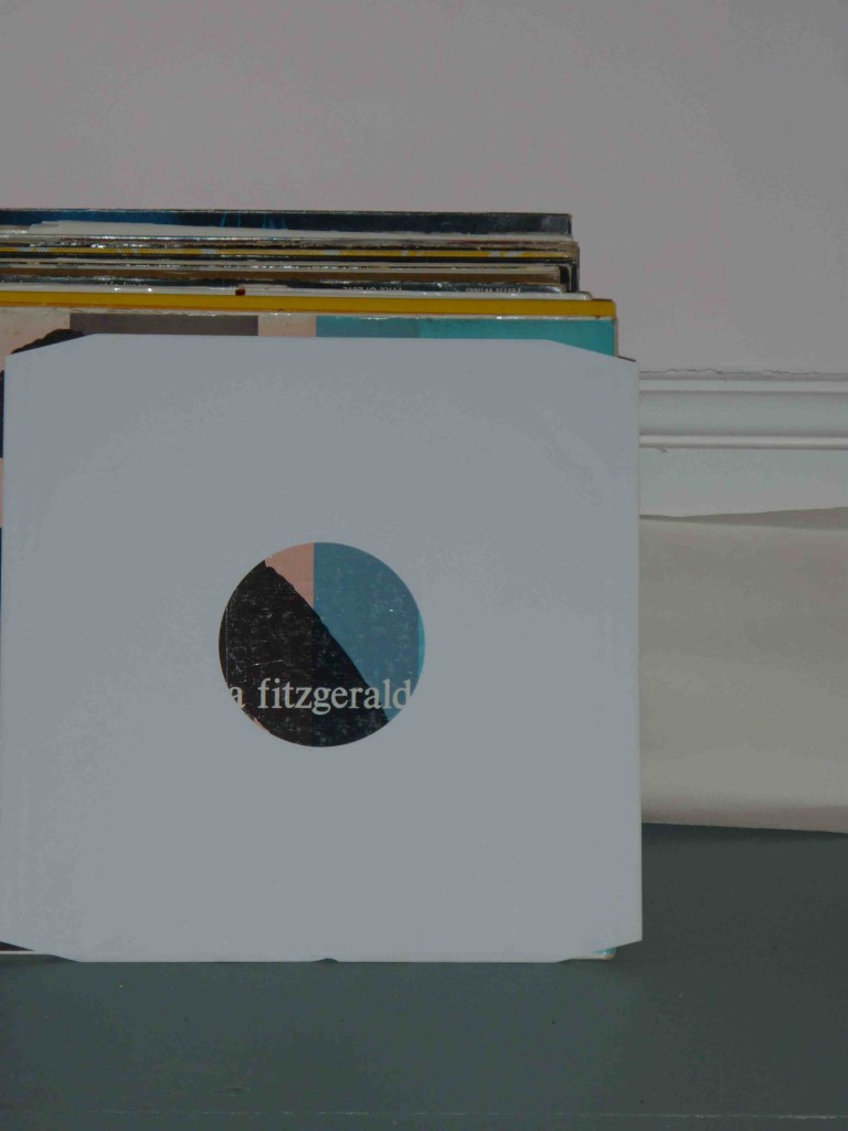
Are the records really pertinent? Well, this shot, of my dad’s Ella Fitzgerald Sings Cole Porter, shows both the grey floor and the Middleton Pink I like. And also a lovely peachy pink on the album cover…
The upshot of all of this is… that I think I’ll go with my first choice, Middleton Pink. I’m a chicken, a coward, yella. The other ones are gorgeous – especially Angie by Little Greene – but just too strong.
A beautiful room by the sea doesn’t need anything jazzy, and the slightly mournful feel of a pale pink seems fitting, like sea mist and a sunset. Do you agree…?
I love all these pink colours. Until recently I had a very deep sugar pink in my bedroom, it was very beautiful at night with the lamps on (although my yellow curtains made it look a bit like a Dolly Mixture in the daytime.)
I like Middleton pink too, mainly because of the name but also because I think it will match more with the pale, washed, grey view that you’ll see a lot of from your windows.
Thanks Anna. I think you’re right too. And there are other rooms that might suit the stronger pinks – bubblegum pink, I’d say. Can I just ask you what the sea painting is on your Gravatar? It’s absolutely beautiful – just the sort of thing I’ve been looking for for the seaside place. Love it x
It’s called Rough Sea at Caerfai, by Welsh artist Gareth Thomas.
x
Thanks a million – might do a post about his website. Love the seascapes x
wish you had tried our Sea Thrift, a soft greyed pink. Next time?http://www.creamcornwall.co.uk/product/sea-thrift-paint/
Thank you so much for posting this. I was searching for ‘Angie’ by Little Greene as I’m considering it for my bathroom. It was so helpful to see it on a wall, especially compared to lighter and darker pinks. I’d been thinking of Nancy’s Blushes too so great to see it there…
Hope your place looks fantastic now,
Annabella
My pleasure! Glad it was helpful. They all looked a lot stronger on the wall than I expected, I have to say. I picked the palest, Middleton Pink, with Pink Ground upstairs. And I think Pink Ground is probably the easiest, warmest one to live with. Thanks for commenting x