This I could manage…
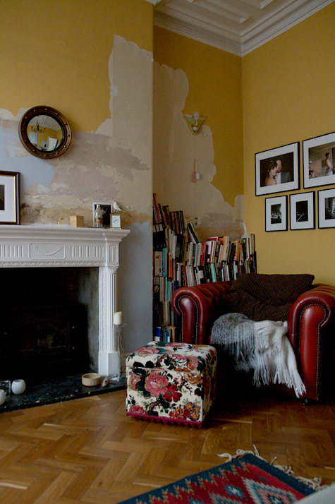
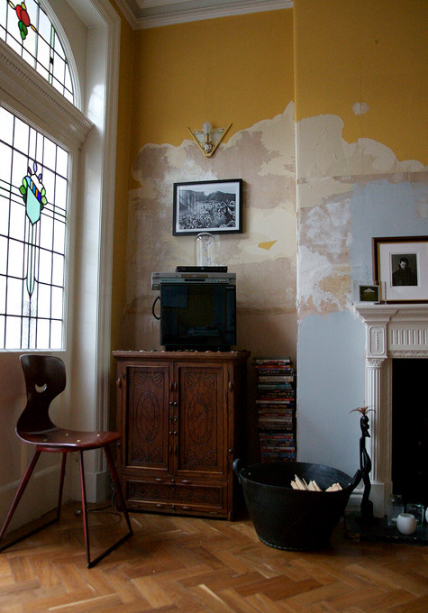
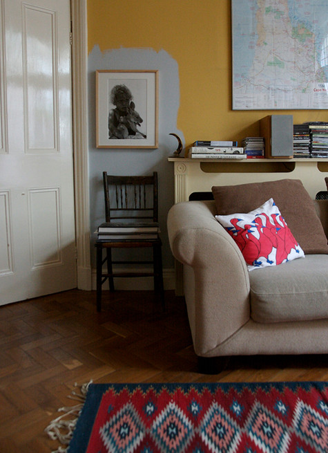
Since trying to paint a room in a rented flat white, getting exhausted and stopping about a foot from the ceiling, leaving a bright green ‘accent colour’ stripe, I have been alive to the possibility that walls don’t always have to look finished. Here is a great example, in the home of Claire Bingham, one-time Homes Ed at Elle Dec, brought to you via Design Sponge.
Lazy or inspired? Claire justifies her decorating choices here, but I think it looks great. The herringbone floor doesn’t hurt either.

More animal magic
I cleared out some cupboards at the weekend and found a box that I once received this lovely bird in from a friend… Another job abandoned, I went a-googling with the name on the box and discovered designer Ann Wood who, from her studio in Brooklyn, makes animals – mainly birds – using vintage and antique […]

New flamingos unveiled…
You know how we at MFH hang on every word from French style blog Ensuite. Well the exciting news is she has unveiled the new flamingos with a confidence we can’t argue with, here… Yes, it’s pineapples people. From Graham and Green. From Caravan. Wallpaper by Timorous Beasties. You heard it here first. If I […]

The world of what if: Sydenham?
Do you ever mentally improve your local high street? Mine needs a decent interiors / gift shop and a small independent cinema, but I do nothing more productive with these thoughts than suggesting business plans to a cynical Mr My Friend. Unlike the blog What if: Sydenham, which creates makeovers in the name of persuading local […]
Looks like a plan
My Friend and I, having worked for a whole shelf of interiors mags between us, have probably both had a pretty intense relationship with floor plans in the past. The homeowner doesn’t want to send you one. Your art director can’t get the dimensions right. But as a magazine reader, I love them! What could be […]
