My bespoke mural – part 2
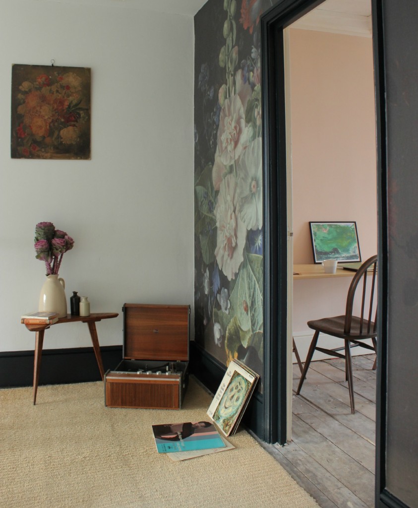
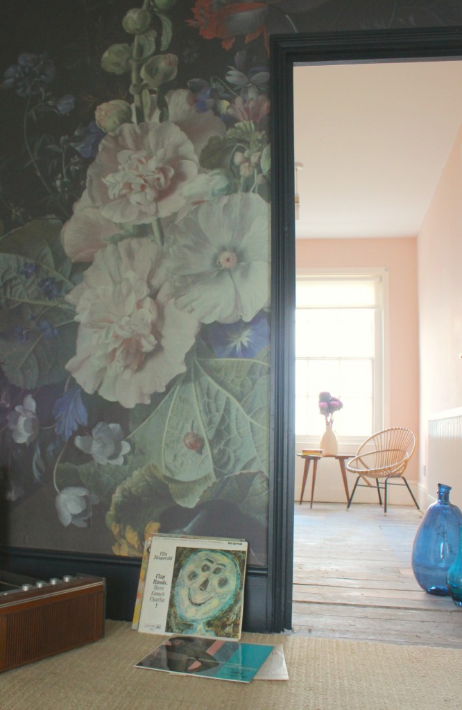
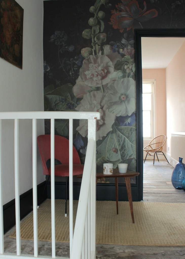
Last week I wrote about mural company Surface View inviting me to pick something from their huge image archive to have made into a mural. As described last week, the process of settling on what to have was lengthy – but fun too. Today I’m going to share what it looks like up on the wall – and how easy or otherwise it was to put it up there! The flat in Margate has a very large (compared to my London flat) upper landing, with space big enough for a reading corner, and views out over the town. Most of the rooms I’d already settled on the decorating scheme for, but this lovely bit of space was totally empty, and I figured that by putting the mural there it would turn it into a little room of its own, rather than just a place to pass through. I also liked that this wall had a doorway in it, leading to a sea-facing room that I’d already painted a warm plaster pink from Farrow & Ball. It added complications to my choice of mural, as I had to pick one where the nicest bit of the image wouldn’t be cut away by the door.
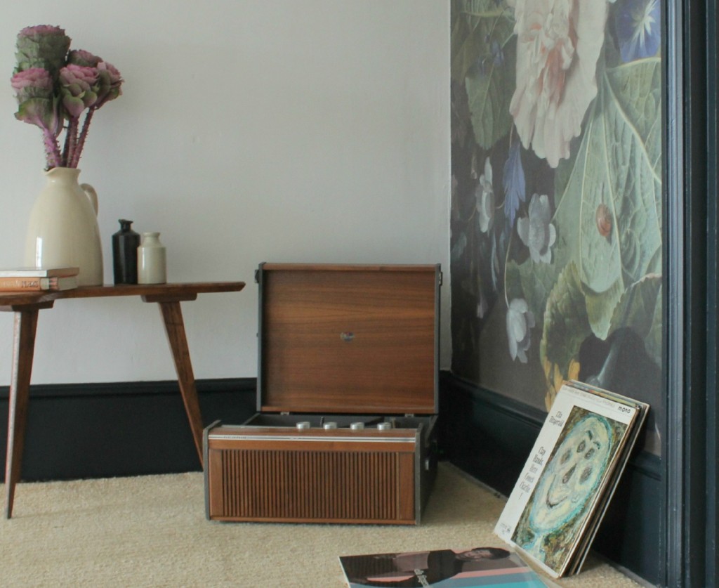
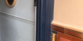
I love how the black woodwork around the door frames and merges with the mural, and the pink in the room beyond picks up on the colours at the centre of the mural. The image itself gets deeper and darker in colour towards the right hand side – in the flat, this darker area runs down the other side of the door frame, and it means the image as a whole blends in with the black wall that is behind it. I’m contemplating painting that facing wall in Mizzle by Farrow & Ball – a lovely grey-silver that seems to change shade minute by minute as the light moves. But don’t hold your breath.
As for putting the mural up, I picked a ‘stick it up’ finish. This means that the mural comes with an adhesive backing. You just pull away the plastic film from the back and stick it up. It sounds easy… and it pretty much was. The adhesive cleverly lets you position and reposition the mural on the wall so you have more than one go to get it right – and unlike any other wallpaper I’ve ever put up, this finished project has no air bubbles in it anywhere. I won’t say the whole process was pain free – a nasty moment when the adhesive backing stuck to itself resulted in a tirade of most unsuitable language which my assistant for the day ignored with admirable patience and calmness.
Surface View’s service not only lets you pick the image and dimensions of your mural, but it also lets you pick your own crop as well, so I was able to make sure the most important elements (to me) of the image fitted around the door frame. The finished mural really does look great, and each time I come up the stairs and turn the corner to see it, it delights me all over again. I’m looking forward to living with it and getting to know it better and better.
Thanks to Surface View for inviting us to pick a mural, to Savinder for taking the pictures, and to Jill for letting the mural go in my house, and not hers.


So beautiful, I’m not normally much of a floral fan but this is so stunning! x
looks amazing! x
thanks Poppy – I’ve downplayed how much swearing there was from me in the post as I got very stressed about putting it up! But I do love it and can’t wait to go back and have another look at it this weekend. BTW the sofa is still celebrated on a daily basis as having changed our lives x
I love it! It looks great there & ties in so so so well with the black wood work & pink room, bravo!!!!!
thank you – the black woodwork really sets it off I think – you can’t see where I haven’t finished the other doorframe though – I kept that bit out of shot!
Looks great, and how kind Jill is to let you have it, i’m not sure Juliana and I would play so nicely : )
It looks absolutely fabulous. X
Stunning Ros. The perfect gateway to the view xxx
really beautiful choice and I love the end result, now even more convinced I need to move to that side of the country…
This looks so great! I really wouldn’t have gone for the Old Masters either, but wow, it’s just perfect, I will make a bee line for them now! It gives the space a gravitas it would otherwise be lacking – really good choice, thanks for sharing 🙂 – great blog BTW!
thanks Kersten! Yes, I’ve had it up a while now and my love for it has grown. I’ve still got the big bit that was cut out for the doorway and am contemplating putting it on a large frame to go somewhere else. Will share the pics here if I ever get round to it!