My bespoke mural – part 1
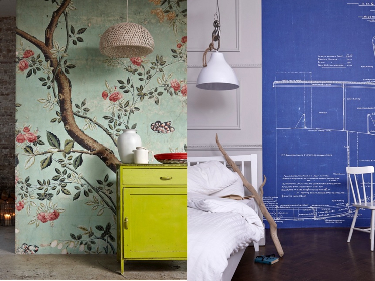
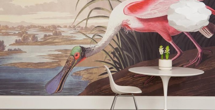
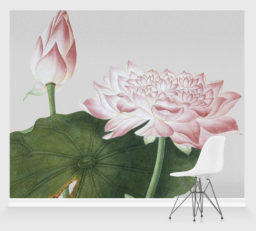
Late last year we were asked by Surface View whether we’d be interested in receiving a wall mural to write about. If you’re not familiar with the company, they specialise in making striking images into wallpapers that can be put up to create a mural. They also do canvases, curtains, cushions and tiles. I’ve always loved Surface View’s creations simply because the style of images they have on offer set them head-and-shoulders above any other company. Their collections include archive images from the V&A, the National Gallery and Portrait Gallery, The Natural History Museum and Getty Images. So the invitation to make my choice of this wonderful resource to be made into a mural was thrilling.
Next week I’ll share with you the results, but this first post is just about the process of picking a mural. I have to admit that if I hadn’t been offered the chance to pick one for the blog, it is probably not something I would have ever got around to, simply because the choice is so overwhelming. As someone who took 5 years to settle on a wallpaper for the living room, I think it would have been just too much. Having chosen the wall I wanted to mural up I at least had an idea of the size, shape and surroundings of the space I wanted to cover, but that is when the real decision-making started.
The site has lots of tools to help you find what you want, firstly being organised into collections by theme or place of origin. I trawled through all the collections for images that appealed to me and made myself a shortlist of…erm… 40 items. In order to whittle it down further I had to come up with rules for myself. I had a really hard think about what I think works on walls and what doesn’t, and also tried to factor in that this was a serious investment. Here are the rules I settled on for myself:
No photography
Surface View have a wonderful archive of photography, from the technicolour glamour of 60s magazine stills to a very tempting series of faded black and white images of an Arctic voyage. In the end though I felt that photography wasn’t an appropriate fit with the old house the mural would be going in to, and also there is something a bit more commercial-feeling about photography that perhaps works better in a bar or hotel interior.
Nothing too wallpapery
Being a wallpaper nut I was very tempted towards images that looked more like a super-expensive wallpaper than a single image, but I kept reminding myself that this was a one-off opportunity to chose something dramatically different, so a single image it had to be.
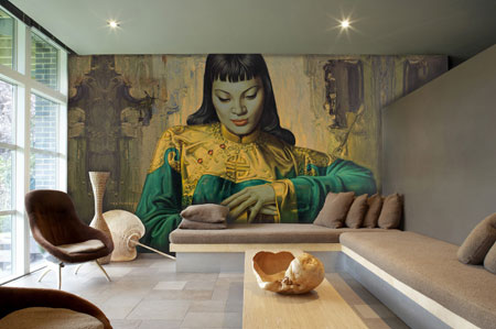
No people
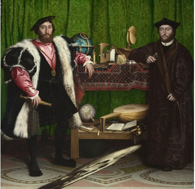
I loved the idea of something playful, and so saved a few religious and historical paintings. The Ambassadors by Hans Holbein the Younger, which reminds me of Chaz and Dave, for example, or a reclining Madame du Pompadour. But each seemed too bold a statement, so I chickened out.
No words
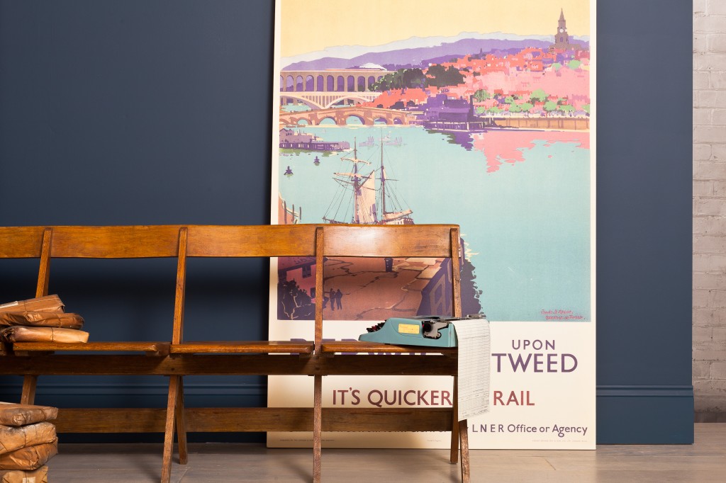
Bookworms will love Surface View’s selection of images from The British Library, including lovely illustrated pages from Edward Lear and Alice in Wonderland. There are also wonderful vintage travel posters and a section of 60s graphic art. However I wondered how long I’d enjoy looking at the words before they struck me as pretentious or tired.
Conclusion
What I finally realised was that the most important thing was to pick an image that I’d still love when it was blown up absolutely huge. Many images I liked, when I looked more closer with the site’s zoom, worked better from a distance. I wanted to make sure that I picked an image I could sit and stare at, and which would reveal more and more to me the longer I looked. Which brought me to a surprising final choice that was nowhere near my first instinct…
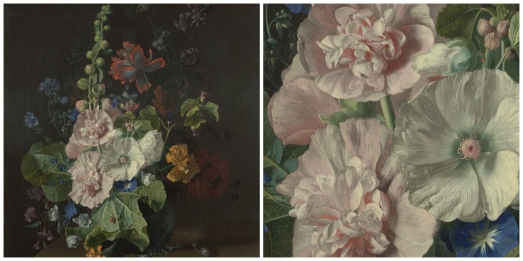
…the Old Masters. I’d already been buying up prints of floral still lives, and loved that the almost photo-realist style of flowers painted in the 1700s just got more fascinating the closer one looked. Timeless and decorative, these images had natural drama and created an atmosphere all of their own. I finally picked out Hollyhocks by Jan van Huysum. The depth of the background, the colours, composition and dizzying detail seemed like the sort of thing that would keep me engrossed for years.
Next week I’ll share the images of what this mural looks like on the wall – and how it was to put up. See you then.
You lucky lucky person! Love your chose of picture xx
thanks Trish – and thanks for my Christmas swan which has a pleasingly naive look about it. Love it x
Gorgeous. Can’t wait to see it in situ. Don’t know if I ever would be able to commit as they all look great.
yes it was a real dream offer! But the decision-making did take me weeks…
What a great opportunity, really good advice on an approach to whittling down the choice though!
thanks. I love formulating a few rules to help me make a decision – but I have to say in a different style of house I would have picked something completely different. The choosing part was all part of the fun!
I adore murals !!! great image selections. They are great way to decorate interiors.