Lovely Lisbon…
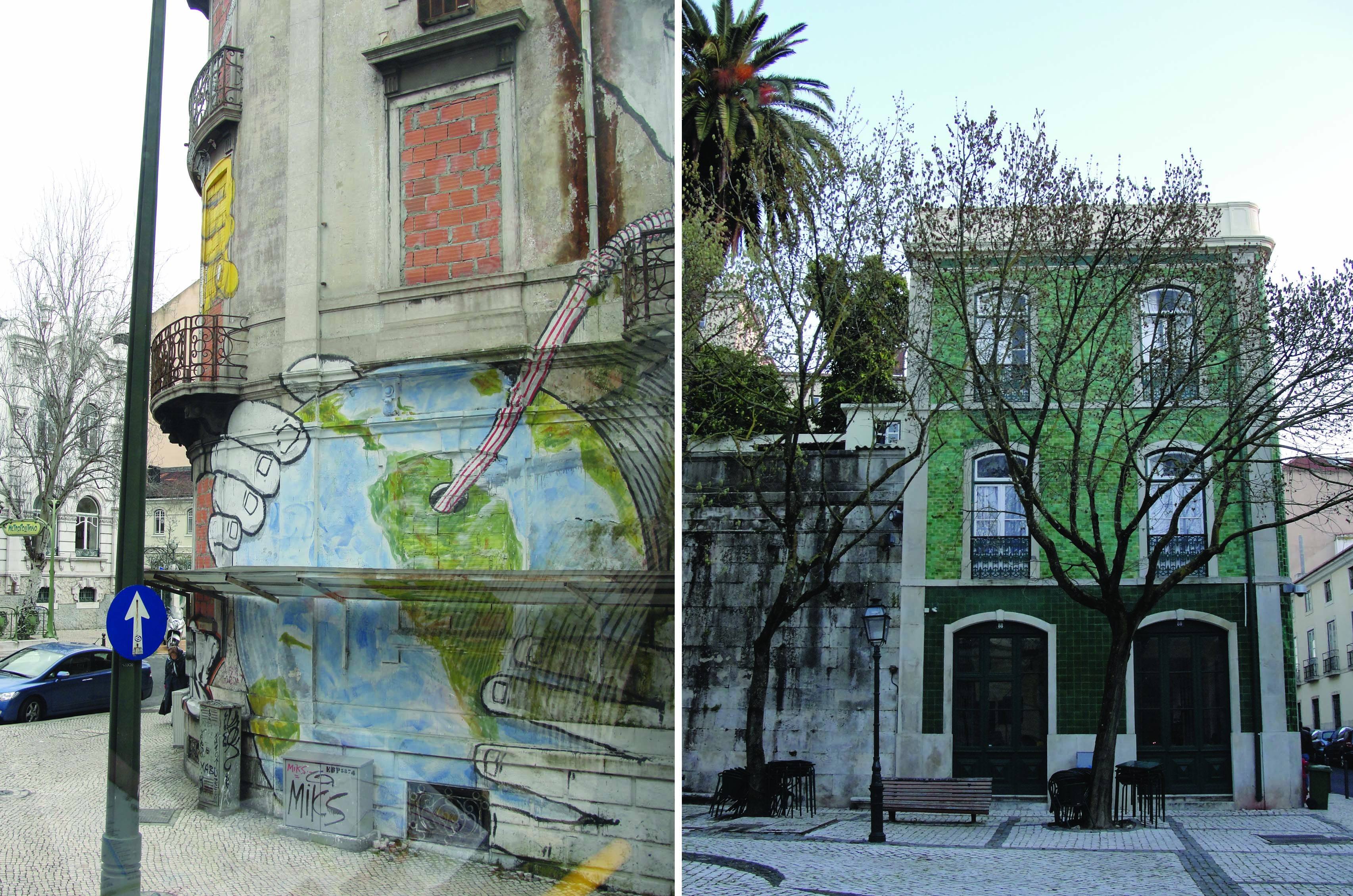
…with your bum-crunching cobbled hills, tidy tiled townhouses and graffiti scene. Yes, after four days in Portugal’s capital I’m sad to return to real life (my own cooking, washing up, yadda yadda yadda). A quick summary of the design scene to follow, but before that a mention of the city itself. Here’s the pavilion that architect Alvaro Siza Vieira designed for the city’s Expo 98…
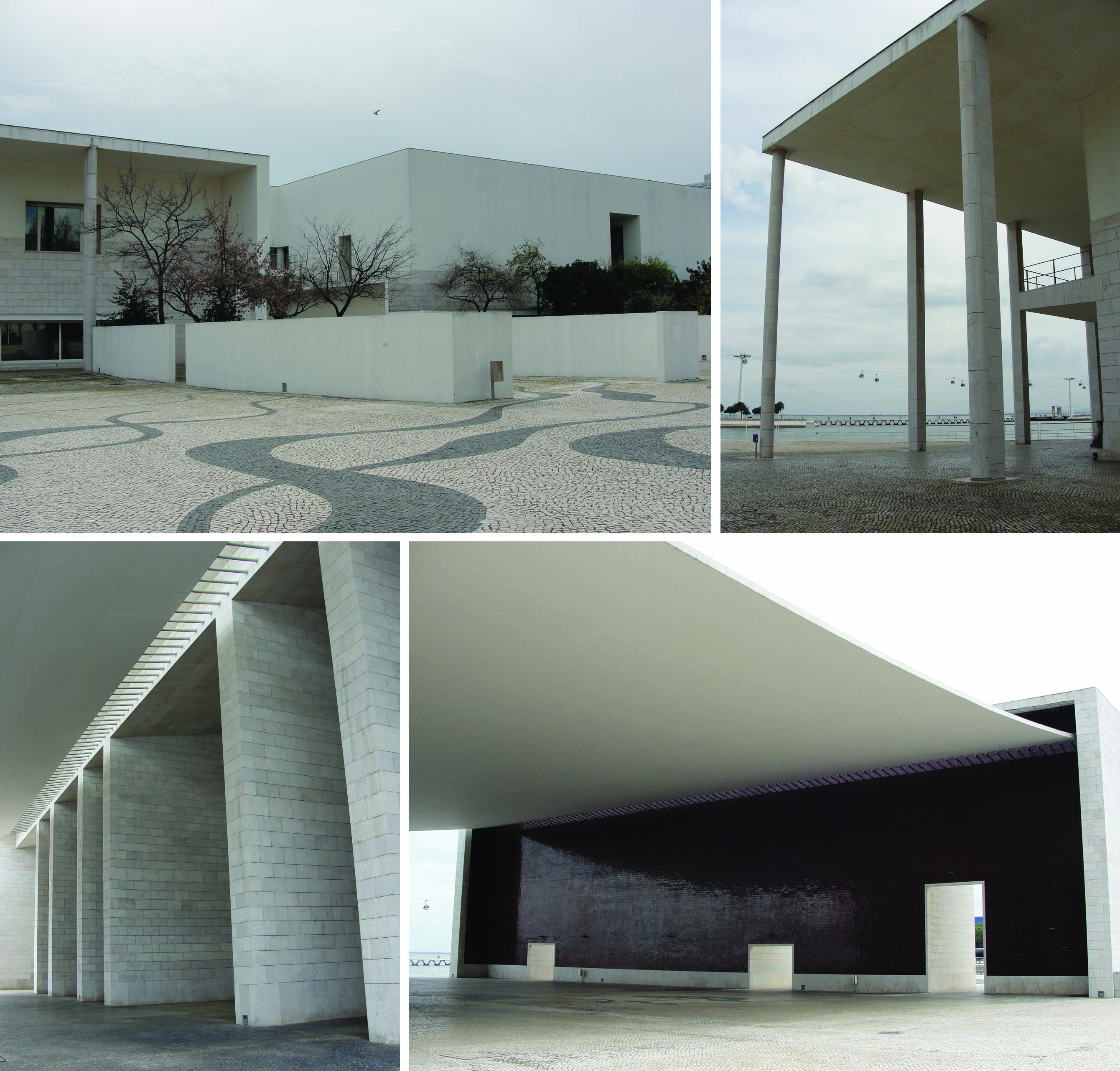 The tiles on the wall (bottom right) at the end of the super-size canopy are an amazing deep red colour, not that you’d know it from my dingy snap. I’d read before visiting that the building is now used as an art venue, so was surprised to find it 100% empty. Echoing, derelict empty. Our hotel receptionist later explained that it’s only rented out for temporary exhibitions – via a slight language barrier, so don’t quote me on this. Shame it’s left for dead in between times.
The Parque das Nacoes area is also home to the mighty striped concrete bench. Check it:
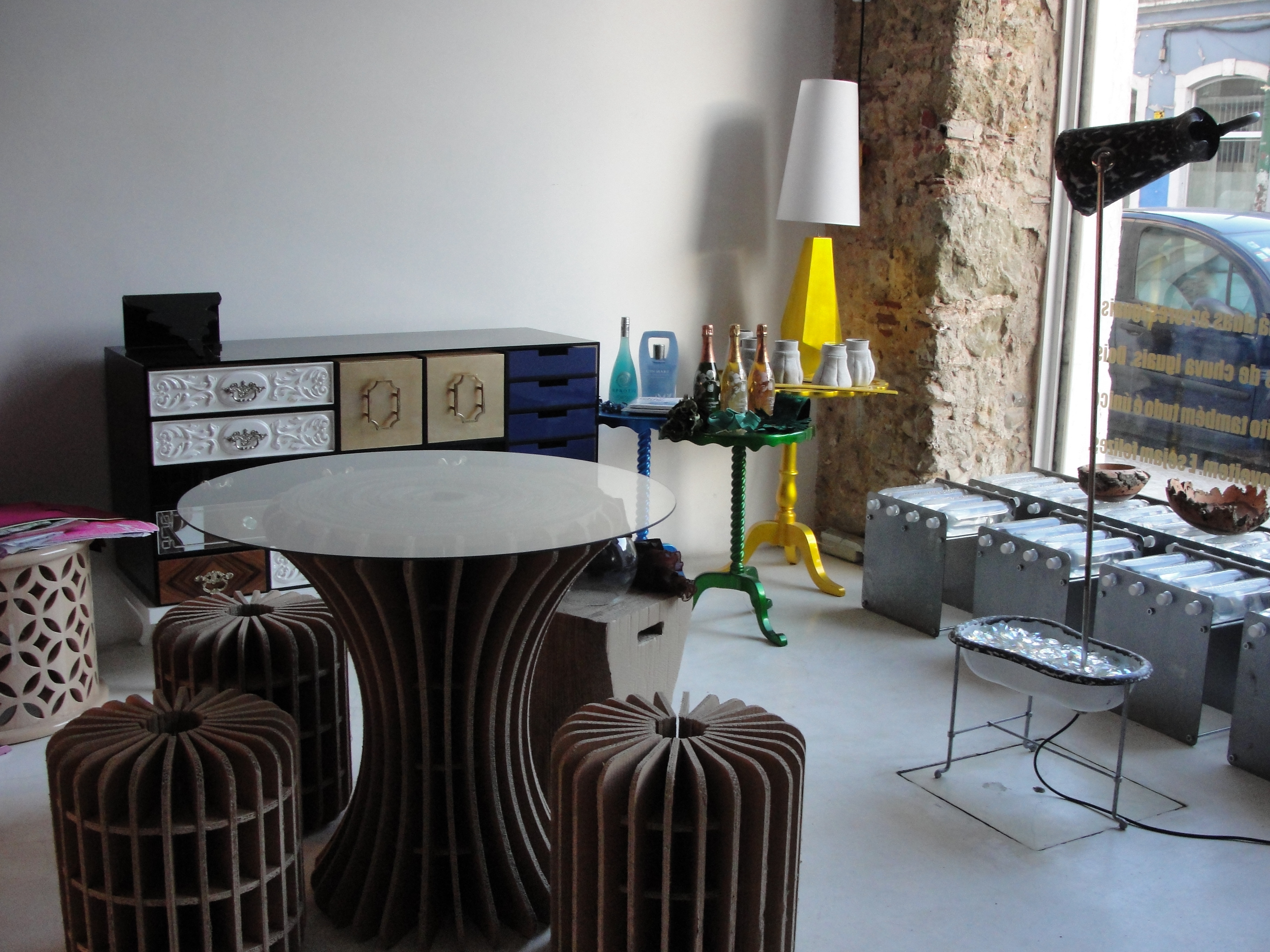
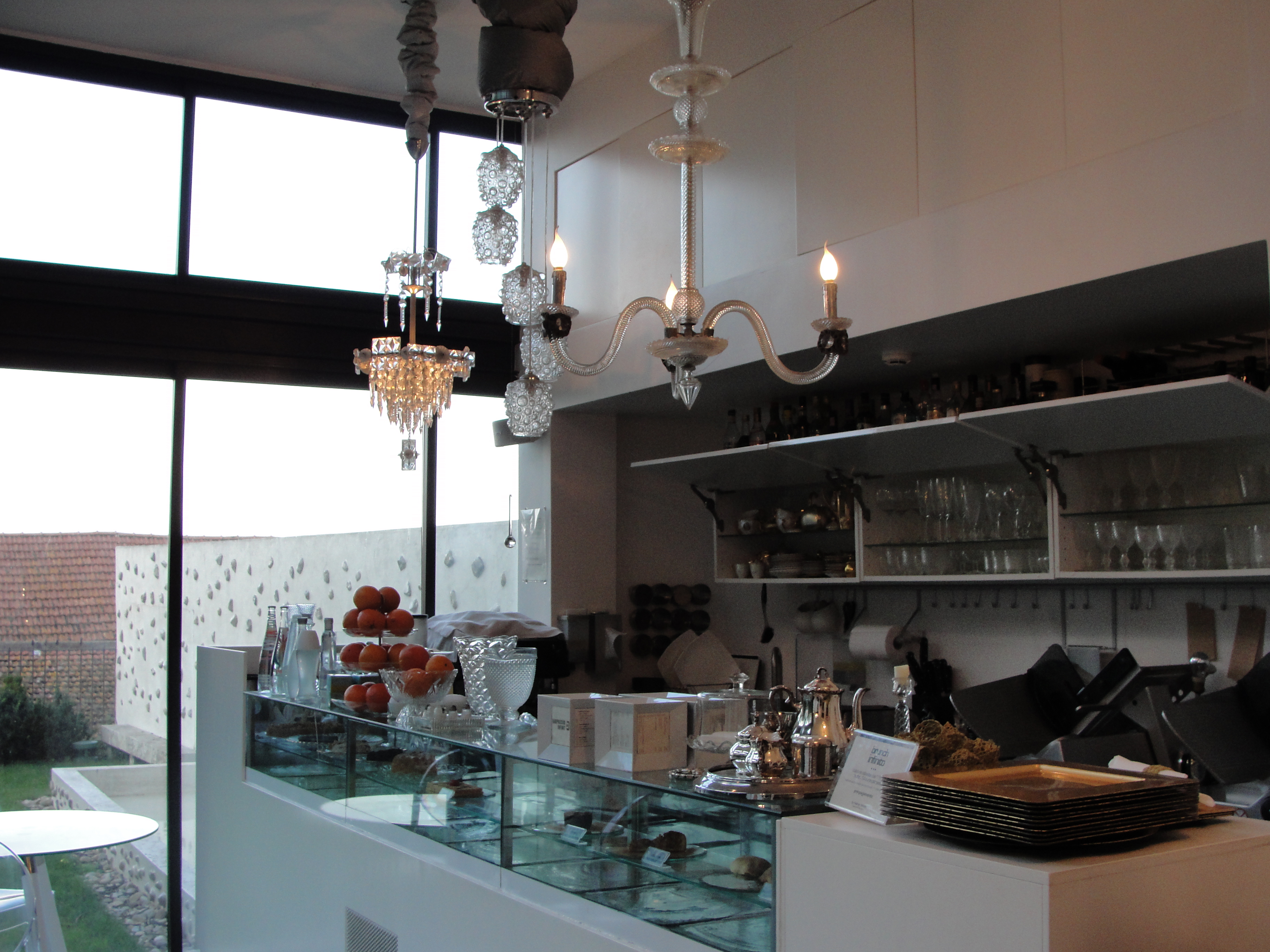
Here’s a tiny taste of the shops – Fabrico Infinito, cool interiors place with a nice cafe, up a major hill in Bairro Alto where I was staying.
Not a design revolution, but that vintage light cluster was tasty.
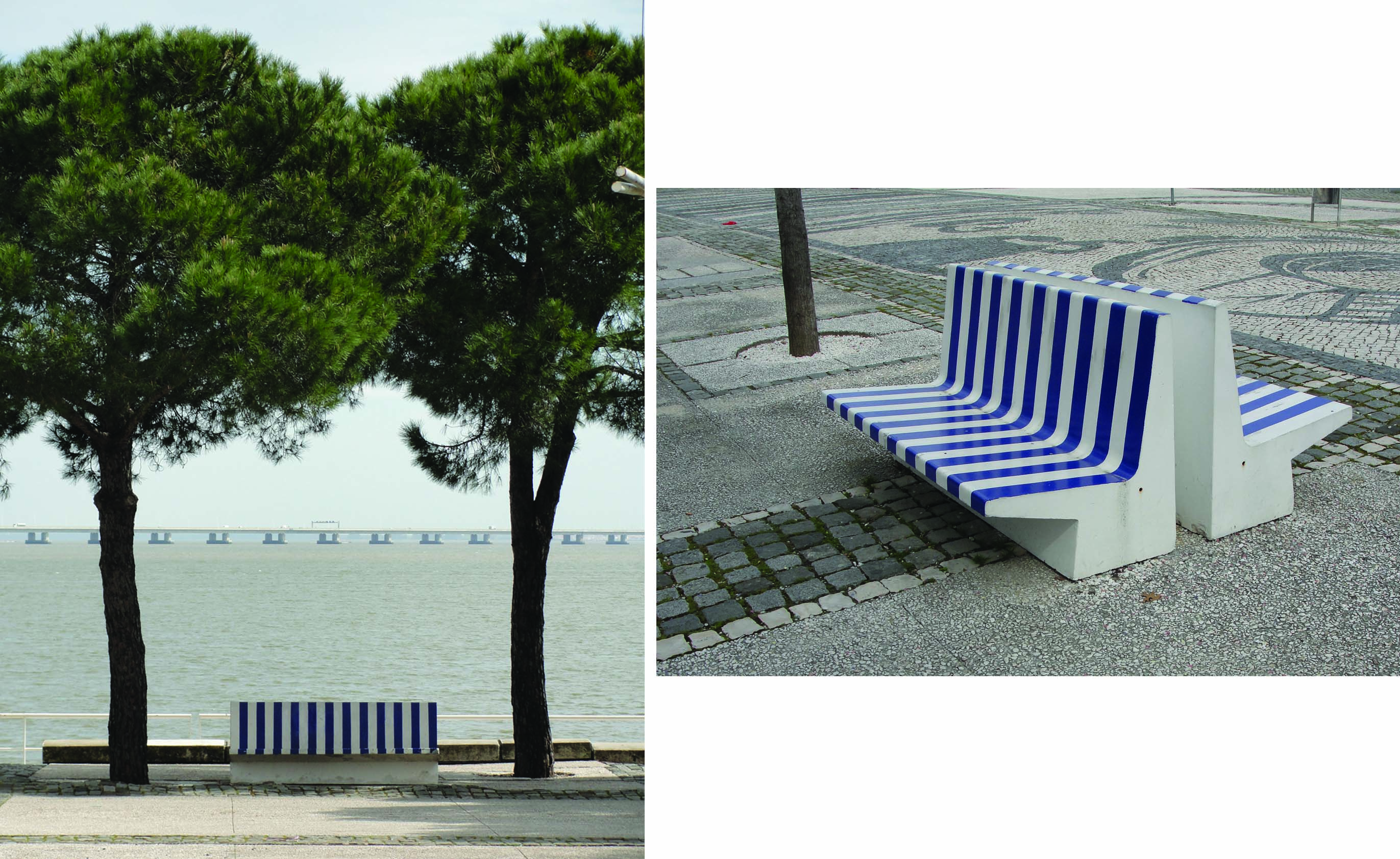
I’m going straight over there in a pick up truck [with winch] to git me a concrete striped bench. Susan Likes This!
Love you long time if you pick some up for me too. There were also brilliant clashy yellow and red ones.
Oooh likey, had there been PINK and yellow, the ultimate cage fighting colour clash, I seriously would be booking a freight container and buying a huge bag with SWAG written on it.