Joanna Thornhill helps our reader with her bedroom makeover
It all started with a message in our inbox.
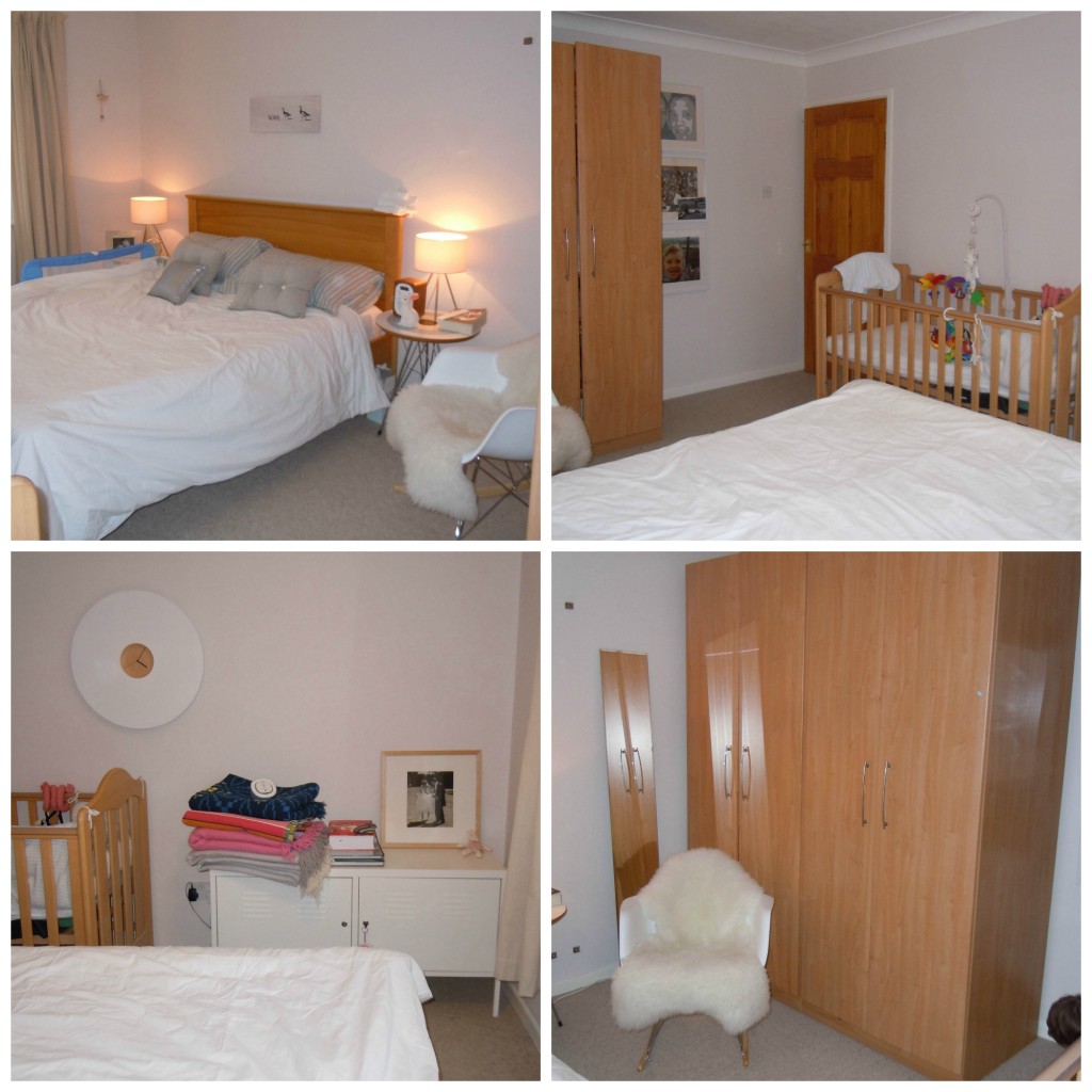
“I started following your blog when my first son was born, feeding constantly, and I could sit on my arse and read blogs. Now, with the arrival of my second son, I have very little time to leisurely scoot around Pinterest and websites for inspiration, but I’m really craving my bedroom to be a much more distinct space from the rest of the house, and much less bland than it is currently. We can’t afford the £100-a-pop wallpaper I feel would do the trick and I just wondered if you or your other followers have any suggestions? Have you ever posted on how to deal with the urge to CHANGE EVERYTHING about your house when you have kids? Look forward to hearing from you! Emma.”
There is a person we know who is qualified to deal with just such a dilemma. Having run her blog Stylists Own, for a number of years, she recently published her first book, Home for Now. Aimed at first time buyers or renters, the book speaks to all of us about how to make our homes beautiful on modest means. Stylist and author Joanna Thornhill kindly agreed to helping our reader Emma and below you can see how. We hope you like it as much as we do and Joanna, thanks for your brilliant work…
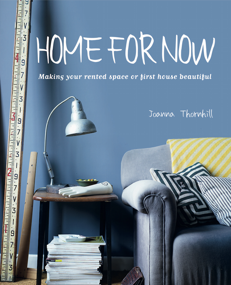
“Going from your brief, you’re keen on breaking with the beige that predominantly makes up the rest of your house, and want to bring in some pattern and colour into the room and give it a feminine touch, without veering too far into girlie territory. And all on a shoestring budget. Luckily, shoestring is a budget I’m more than familiar with, so here’s a few ideas to get you started: You mention a few Farrow & Ball colours you like, namely darks and chalky, muted pinks. As your room is south-facing, I think you could afford to go dark on the walls, but bring in these lighter pinky tones with accents and accessories. A blue/grey will help give a smart finish. I’d avoid going for the obvious feature wall and keep things a little more tonal – how about the gorgeous Stiffkey Blue (1) on your bedhead wall, with a slightly lighter (and less scary) Lulworth Blue (2) wrapped around the other three walls? This image from my book shows how stunning a dark blue wall can look (it’s also a feature wall within a modest room).
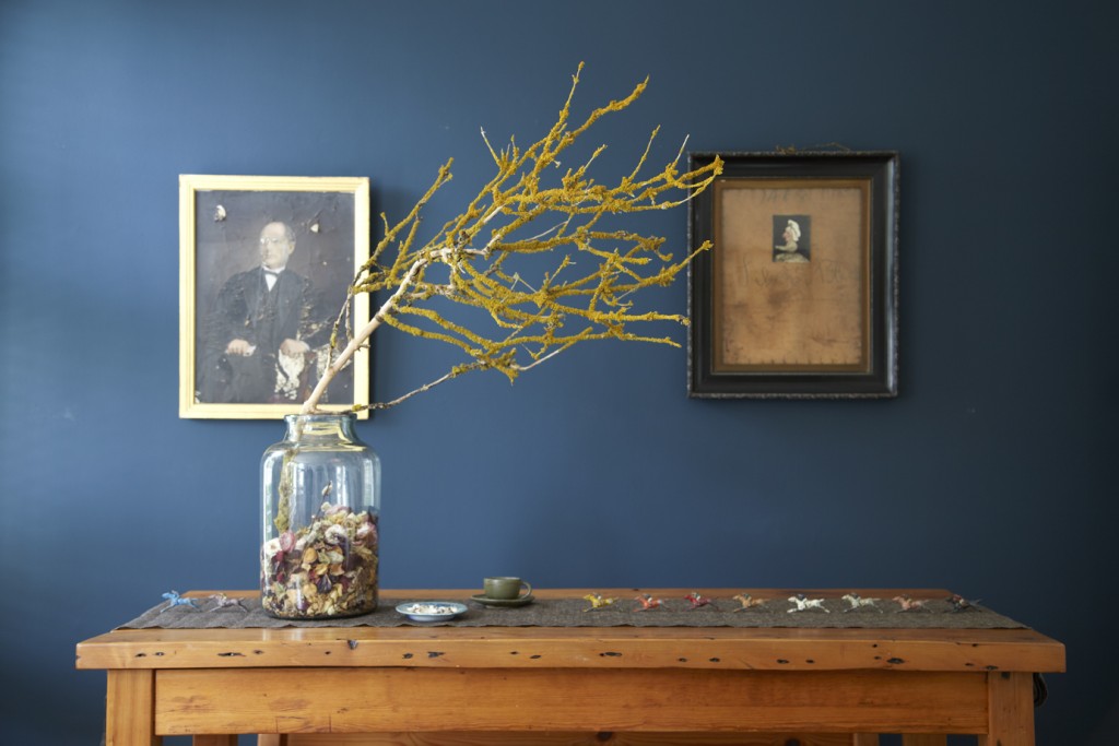
You’d like to bring more pattern into the room. The cheapest and most versatile option is to do that through textiles. Go for a mismatched look, keeping a running thread throughout with co-ordinating colours (though I like adding in the odd element of wrong-ness to break things up a bit). H&M does brilliant bedding at bargain prices – something like this softly faded design (3) would add a touch of femininity to the room without being husband-upsettingly girlie. It also pops out against the dark blue walls.
Accessorise with throws on the bed and over the wooden headboard for added softness. Then for the curtains, consider Zing fabric (4) from Scion to provide pattern with on-trend painterly stripes – they’ll easily mix with other patterns in the room. Cut costs by using your existing curtains as a lining and sew this fabric over the top (you could even attach it top-only and let the sides hang free for a wafty look). Let it run all the way to the floor.
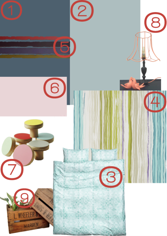
You could create a similar look by instead painting some stripes onto your existing curtains with fabric paint. You could even paint a couple of slim horizontal stripes like this Dulux scheme (5) onto the bedhead wall, as a nod to the curtain design and to add a touch of interest.
Your wardrobe is, as you say, not exactly a thing of beauty, but it is practical and would cost a lot to replace. It looks like melamine and my advice would be to paint it with some Chalk Paint, which will adhere well to this surface without you having to sand and prime it first. This could be a good spot to bring in some of the dirty pink colour you like – Annie Sloan’s Antoinette (6) for example. I’d then replace the existing handles with something more striking, such as these contemporary coloured handles from Chocolate Creative (7).
Lastly, the fun stuff – accessories! Your bedside tables are fab, but how about more industrial lamps? Take the fabric off the shades and spray paint the base and wire frame in a bright hue, then add in a vintage-style bulb (this example from Arthouse Attic on Etsy (8) illustrates the idea).
Rather than leaving your lovely collection of throws on the side, which makes them look like they’re waiting to be put away, consider housing them in a vintage fruit crate from Emma Loves on Etsy (9). Stand one on your locker or wall mount it to free up this surface for ornaments and a smart lamp.
I’d then move your floor length mirror into the alcove next to your wardrobe, and nestle it in amongst your family photographs (or even mount it onto the side of the wardrobe itself).
Keeping your photos in this area is a smart move, so you can dedicate the bulk of the room to more design-based pieces. You could use the area above the bed, along with the opposite wall, as your key spots to start a curation of smaller artworks, 3D pieces and ephemera. These two images, also from my book, show easy-to-copy approaches, which you can add to over time.
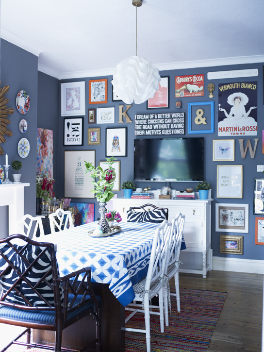
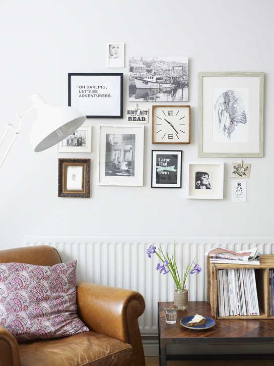
Go for a mix of framed pieces alongside more casual prints held up with washi tape, to minimise framing costs.
Good luck – and don’t forget to share some photos when you’re done!”
For many more canny and crafty ideas, buy Jo’s book (available everywhere)! You can find a full list of stockists on her website.
Thank you, thank you thank you.
I’ve been struggling like Emma to deal with a bedroom which is just a bit boring. I treated it in a similar way….we’ve got functional but fairly unattractive wardrobes, a lovely wooden bed and some nice voiles at the window but the whole thing lacks any kind of excitement. I wrote about it recently as I was considering Stffkey blue too….its stunning….but haven’t yet plucked up the courage. This has inspired me to go for it but problem is which image do I go for? The gorgeous blue at the top along with the picture collage (I’ve got a bit of an arrangement on the go already above and around my dressing table…..) or the stunning bottom image where all the frames are white, black or wood. Hmmmmmm……..
Great post with oodles of links and ideas, particularly like the chocolate creative door knobs and the tip on how to paint melamine. Xx
Well, it all looks lovely and very inspiring. Thank you ladies and thank you Joanna… Virtual high five! I’ve been mulling over blue for a while and i love your take on it. Love the way you have taken my random musings and pulled together something that really makes sense to me. Thank you again. You know the feeling when you see a very unflattering picture of yourself and it sends you into some sort of action? Same with bedroom. I will send pics, just bear with me. THANK YOU AGAIN Xxxxxxxxxxx
Hi Emma, Glad you like the plans! Do keep us updated on how you go. I think dark is a good move – the rest of the house is pale and it’s not like this is a room you spend all your time in, so is less scary than, say, a living room. Good luck!!
This wows me! Thanks for the ideas!