High Street Honeys
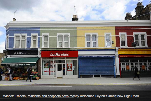
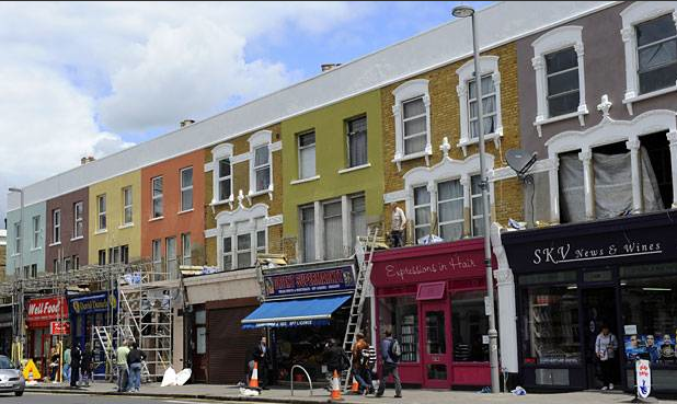
I saw this story in last night’s Evening Standard, about how Leyton High Street has been transformed – to the delight of some and the consternation of others.
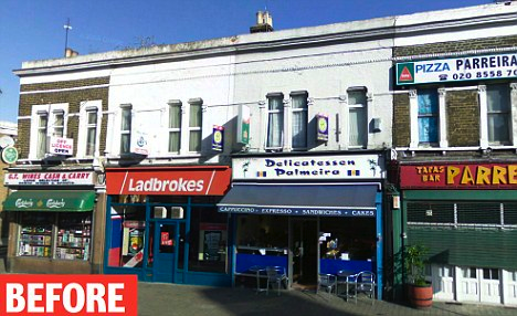
Above is the AFTER, while below (from the Mail) is the BEFORE, a picture subheaded “Tatty”.
Myself, I have mixed feelings. Am I being a reverse snob? I’m the first to get excited about a fancy new butcher’s in the neighbourhood so what’s my, er, beef?
It reminds me of the fantastic What If: Sydenham, the fantasy high street makeover website we featured a while ago, where a Sydenham resident with aspirations and access to Photoshop digitally makes over local shop fronts. And yet I also like the BEFORE shot.
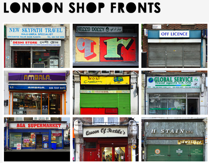
Above is the homepage of local shop blog London Shop Fronts. Shouldn’t a local high street be a confusion of faddy fonts and grocer’s apostrophes? Isn’t there character and value in this kind of design too? What do you think? Tastefully sign-write your comments below. Thank’s.
It looks better now. There are enough high streets with ‘character” in London.
Agree about the mixed feelings. Rather a run down “Aladin’s Cave” than a boarded-up shop, but it’s nice to think of the flats above a row of shops all being lived in.
I find it a tough one, lots have people have sent me these before and after pics (and the Daily Mail article http://www.dailymail.co.uk/news/article-2160777/London-2012-Olympics-Leyton-High-Road-gets-new-look-thats-Notting-Hill-EastEnders.html).
I’s pretty clear that I love the character and narrative in the “tatty” shop fronts, these are the ones I am drawn to and these say London to me. If everyone followed Waltham forest in sprucing up the high streets “for the olympics” would that leave us with bland uniformity?
Although of course saying that, if it means the local businesses do well, then I support that – I’m not as happy with the idea that betting shops might have got free money.
Emily a.k.a. London Shop Fronts.
Thanks so much for your thoughtful comment – it’s great to get your opinion. Interesting to see you too have mixed feelings. But, as the daughter of an independent bookmaker (in the 80s) I will say that I wish they’d left that classic Ladbrokes signage alone. x
I’ll clarify my betting shop comment; I was getting at big chains being given council money, when they can afford it themselves. Although I am making assumptions that this happened, rather than knowing this is the case.
You really need to check out this Ladbrokes in Clapton http://goo.gl/maps/IwlH it doesn’t have photos of sports it amazing illustrations like this http://www.flickr.com/photos/emilywebber/3959708448/ – I’ll also leave this beauty for you http://www.londonshopfronts.com/post/83690666/campbells-bookmakers-ltd-queensbridge-road-e8
Leyton High Road has that forever winter feeling about it. I used to live around the corner and it depressed the hell out of me, so it’s good to see what a lick of paint has done to the place. Yes, you could say that the landlords should be doing this but that’s not how it works. In regards to kooky shop fronts, there are a few side roads near Leyton high road that have various shops. There did used to be quite an odd antique shop that had some taxidermy aligators inside.
Thanks for featuring the What If Sydenham project again (Billings is real, it isn’t a virtual makeover). I agree with Emily about Ladbrooks, I’m not sure why they are getting public money to change very little. The new ones do look better though. I’m all for old shop fronts and character (there are some beautiful ones in London), but truth is most of our high streets now look the same with generic aluminium frames, the same style roller shutters (that no-one cleans) in a few different colours, the same style generic back lit boxes. It smells of decay and a lack of pride (and hygene).
Thanks for your thoughtful comment. I agree, but also I like the idea of paying attention to what currently looks bland and generic – seeing the Spencers’ Shoes 60s font in Peckham makes me happy, but once it was probably just the same old font all the other businesses had too. My Dad used to be an (independent) bookie so I also agree about Ladbrokes but just love their trashy 80s corporate red x