Design classic – dismissed
A hater writes: I’ve been meaning to start an occasional series for ages, on supposed design classics that I just totally don’t approve of. Like our idea for ‘men’s week’, it had sort of gone by the by. Until, that is, seeing this on Lampshade reminded me of my number one iconic design bugbear.
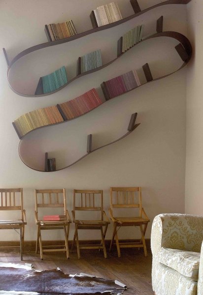
I’m not a big Ron Arad fan anyway – mainly because he was once rude to My Friend – but his much-loved Bookworm bookshelf has always bugged me. It’s willfully wacky, and seems to me to miss the point about many of the book’s most pleasing aesthetic qualities. Like, they’re flat and rectangular and stack and line up really nicely on a shelf. The picture below, from Ron’s own website, demonstrates better why any booklover wouldn’t give it house room.
This is book shelf anarchy! Spine chaos! Plus the shelf itself looks like something the cool but annoying squat party boyfriend you had in 1995 made out of some tat he dragged from a skip.
Any other nominations for celebrated designs that miss the spot? Please post in the comments, and I’ll put them up for debate.


Tee hee, I can’t wait for more of this series! May I nominate the Egg Chair? Mainly based on the fact that I would be beyond mortified if anyone thought I was drawing my design inspiration from Foxton’s Estate Agents. Brash, common and overpriced (they’re made for each other)…
Thanks for the nomination! The Egg chair will receive some cool dispassionate appraisal in the ‘Dismissed’ slot soon.
Ha ha, I love this! Can’t wait to see more… and yes I totally agree. Only ever seen this look good once that I remember… in an all white loft and it was a red version (and they had no books on it!)
Thanks! There’s loads of things I don’t like so I might make it a regular feature. It seems very of its time to me as well, The Bookworm.