Decorating dilemmas

Trend or travesty?

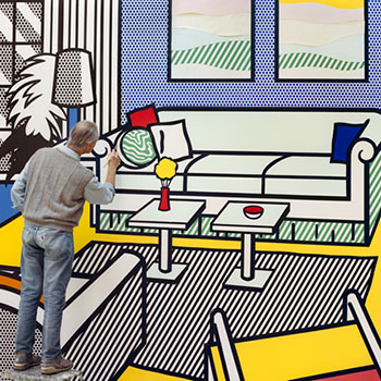
So very hard to write anything now without starting “F***  your….”. But here goes. I’ve been writing about a house with bright yellow walls and black outlines this week. It took me back five years to another house I wrote about – the New York apartment of designer Thomas Paul, which has bright yellow walls and […]
clock vignette

Forget you

My attention has been drawn to a tumblr site, the concept of which is so simple I wish I’d thought of it myself. Yes, F***YourNoguchiCoffeeTable is a regular post of a single interiors picture and caption. The one below reads, “F*** your giant wall word.” As a puncturing of design snobbery and hipster nonsense it’s perfect. A lot of pleasure […]

New obsession

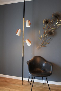
Pole lamps. How can they be so right when they sound so wrong? I didn’t even know they existed until two days ago. An American design from the 40’s, the original is by Ted Stiffel of the Stiffel Lamp Company in Chicago. Let’s not dwell on where Ted may have been ‘hanging’ in his down […]

Velvet, new colour clash, the usual

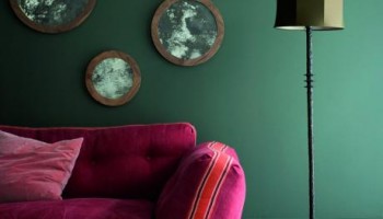
Three things I thought when I saw this image on Ochre’s website… 1. I’ve got a green wall like that. 2. I like the way that green wall works with deep pink, tomato red and dusky pink velvet. 3. I should really get my Nan Chairs upholstered. Project time? PS Did you know that Ochre, […]

Kate Spade sneakers

Spring look

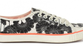
I’ve never seen this picture of the wallpaper designer Florence Broadhurst before, but it’s going on my fridge. That’s the place where I keep a record of looks to adopt in the future. I’ve also just recently seen that Kate Spade is the latest to design using Broadhurst’s extraordinary prints, putting the  ever-lovely Japanese Floral […]