Another person’s tile drama, but this time bathrooms
The most unreal news in my life for the past few years is that we bought a plot of land in the highlands and are building a house on it. It’s not lost on me how unbelievably lucky this makes us, but skimming over that swiftly….we’ve got an interior designer on board. Her name is Jill Macnair and yes it’s me and holy heck it’s a big project to wrap a head around. I know, you’d think having blogged here for seven years on and on and on about ‘I want this’ I’d have a very clear picture of what we should do. Well I do, but actually getting it all out of the head and into a house that’s a bit more country-rustic than my London home is a big task and an even bigger responsibility. The hope is that we have this home forever, a permanent link to Scotland for us and our children to visit as much as we can and a place that our whole extended family can use.
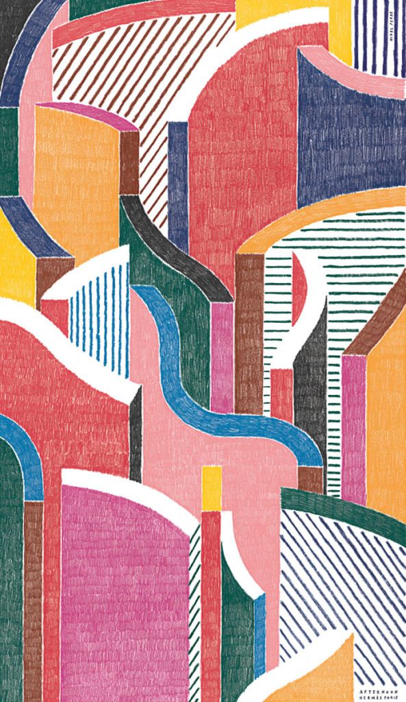
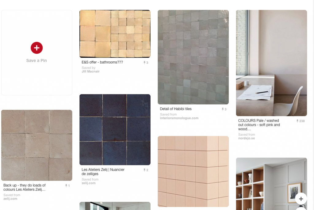
Anyway, I’m in the process of working up the bathrooms and so have been going through my own tile dilemmas. I started a bathroom moodboard on Pinterest originally called Abstract Bathroom Moodboard, because for whatever reason I was designing something in my mind around this amazing drawing by Nigel Peake – actually screens based on city ‘scapes that he did for Hermes.
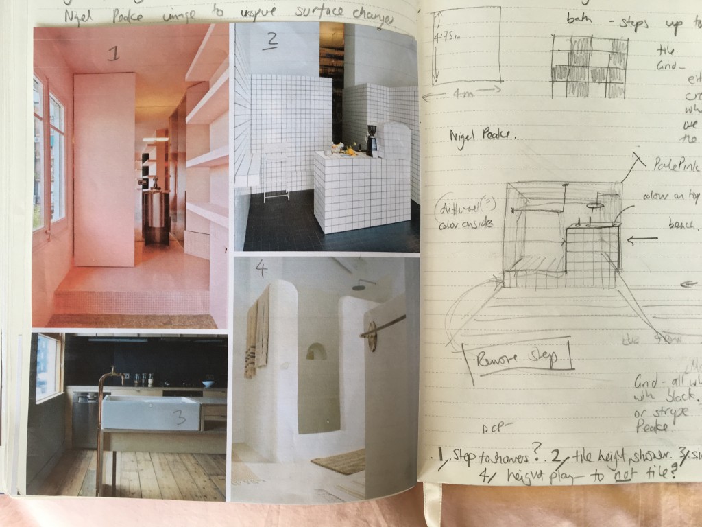
 In my excited mind it sort of related to some disparate images of showers and tiled interiors that I liked because they played with height – the below four especially – and I love the idea of using contrasting colours and patterns on different facias. Although I am trying not to be so crazy with this project!
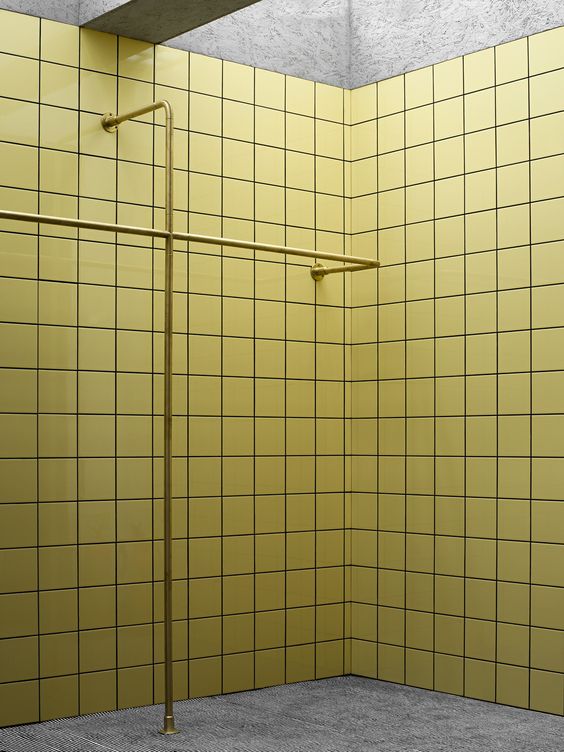
No, I’m trying to be less colourful than usual and more led by natural materials in keeping with the location of the house. I think it needs to be soothing and quiet rather than filled to the rafters with the latest combination I’m trying out. But old habits die hard! I pinned this the other day because I love it so much…
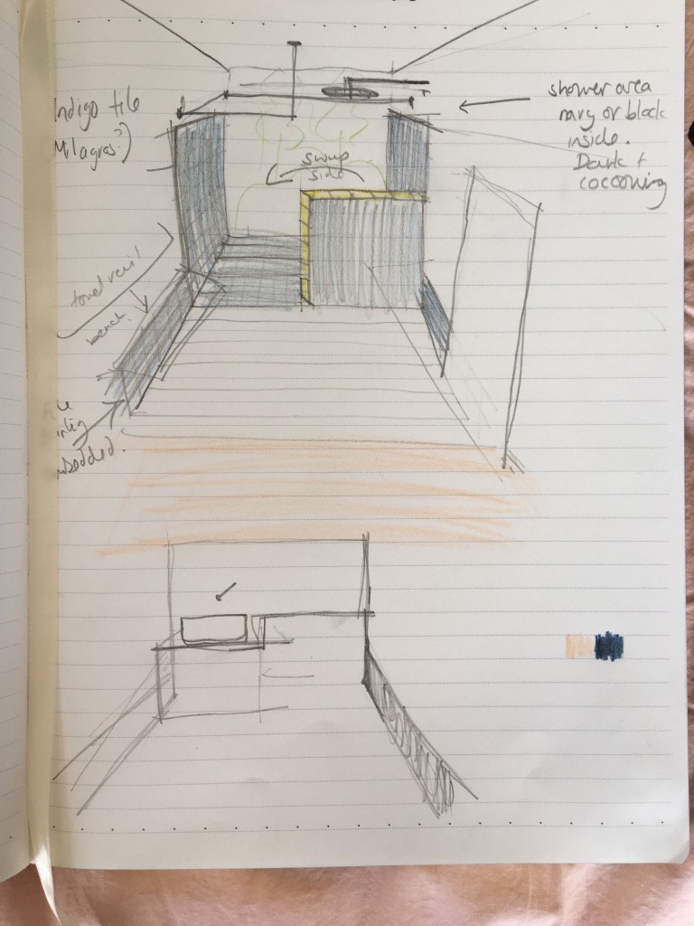
Here’s another terrible drawing from my sketch book that shows what I’m thinking about for the shower design (and how that yellow sneaked into proceedings). The shower is the main feature of the room to my mind as it’s ‘in the view’ as our architects say. Having a bath or shower right by the window is something that was in the brief from the start – no not because I’m an exhibitionist, the house is backed by nothing but views of the loch, green fields and sheep.
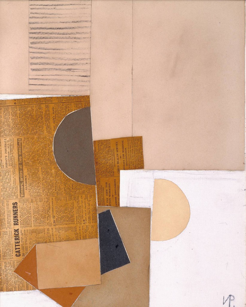
Here’s another image currently swirling around my head for mood and colour. It’s by Victor Pasmore and tapped into more thoughts I was considering…
…a dark, navy or midnight blue tiled shower area, with potentially accents in nudes (or yellows but probably not yellow).
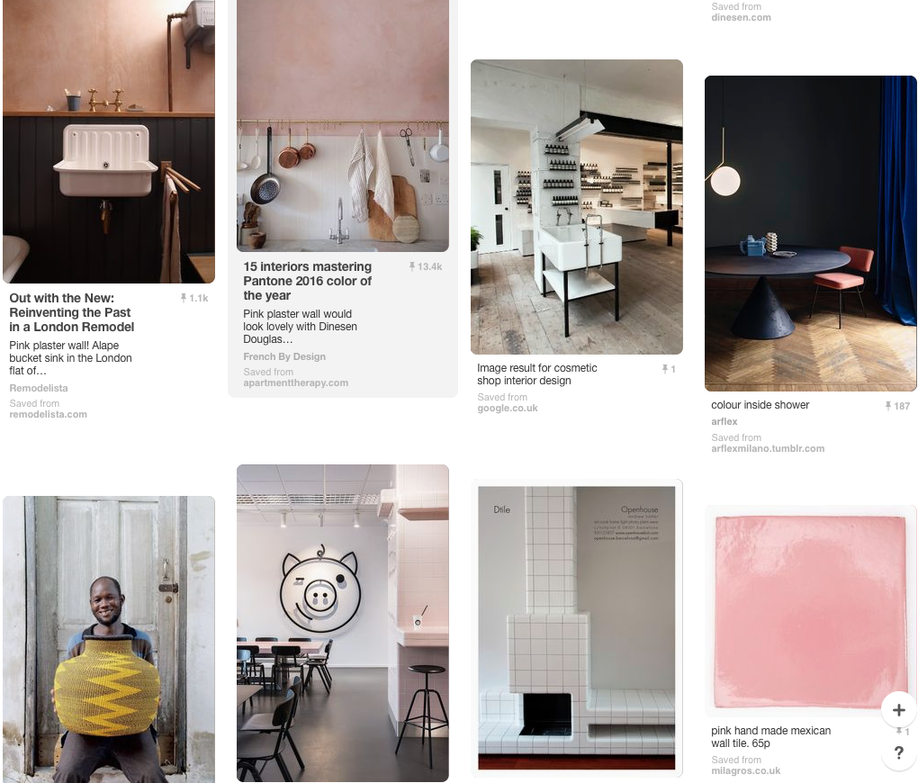
But I have to admit my Pinterest board is still a bit schizophrenic looking. I haven’t quite made up my mind how these tiled surfaces and different colours are going to come together.
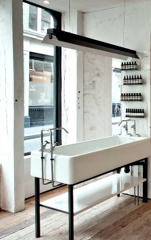
And more than that I need to decide upon the actual tiles and also make sure they are in budget. I do know that I like square tiles and grids, I want the shower to feel delicious and that the other side of the room – where the basin is – will be a bit rustic-modern with a butler-belfast-whatever basin to feel a bit like this Aesop shop’s one (but probably not as nice and def not as big).
So this is what’s keeping me awake at night at the moment.
For Moroccan tiles, including Zelliges, I can highly recomment Emery & Cie (http://www.emeryetcie.com/en/what/). So many colours! So many choices! It took me about a month to choose my concrete bathroom tiles…
god how exciting !